Visualizing Disease Stages and Progression:
The first visual representation and analysis is Path Analysis using Sankey Diagram. WHO China Joint Mission released a report based on its study on novel coronavirus disease (COVID-19).
One of the key information in the report is the visualization of the pattern of the disease progression based on the laboratory confirmed cases.
Let us try and understand the analysis (Figure 1),
- The relative size of the boxes for disease severity and outcome are proportionate to the number of the cases reported
- The size of the arrows are proportionate to the number of people who recovered or died
This single visualization has the power to provide information related to the disease progression (stages), the outcome within stages, the no of people who have recovered/died within the stage and the trajectory through combination of multiple colors. The report and definition of the stages can be accessed here.
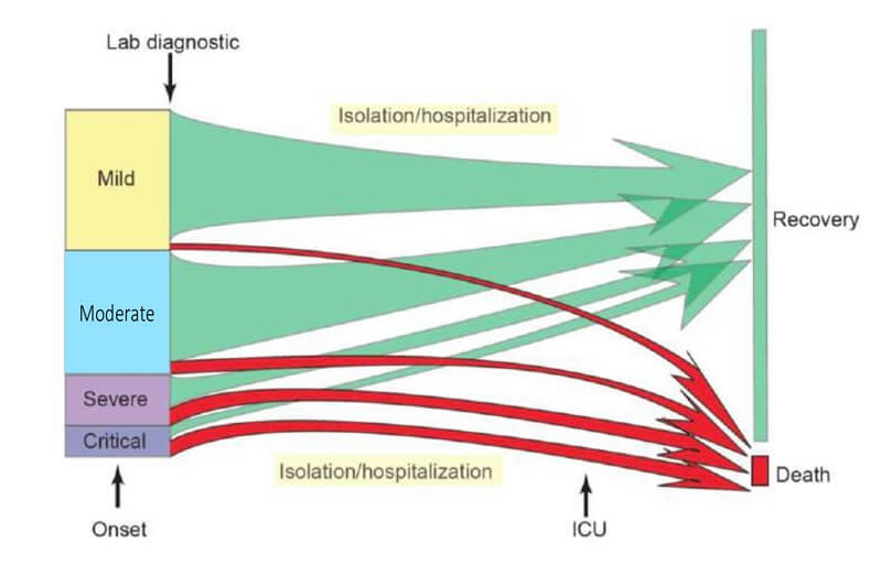 Figure 1: Pattern of disease progression for COVID-19 in China based on 55924 laboratory confirmed cases. Source: WHO China Joint Mission on COVID-19 Report
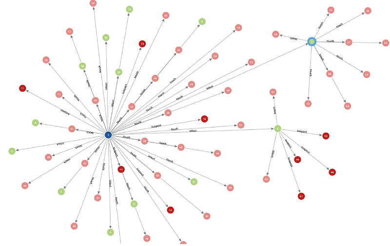
Visualizing Contact Tracing and Locally Transmitted Cluster:
The second interesting visualization and analysis technique is Graph Analysis. Let us look at how Nebula Graph, created by an open source Graph Database company and coding academy at Singapore, built a network map of COVID-19 cases.
In case of Nebula network graph (Figure 2), it looked at data on how five people became infected with the novel coronavirus in just one city, Tianjin. The network was loaded with data of people who are either healthy or sick, based on the physical address that those people travelled to. The data eventually helped to traceback the known carrier of the novel coronavirus. Though the numbers are too small in this case, such visualization proves to be an excellent method to track contact.
The network graph created by the Singapore based company (Figure 3) focused on using the data to visualize the degree of interconnectedness between cases and infected clusters within Singapore. Each node represents an infected person and the edge represents the transmission of the contagion through a known contact.
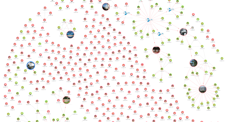
One such similar contact tracing network graph for India can be found at covid19india website.
Visualizing Genomic Epidemiology of COVID-19:
The third visualization technique is a Dendrogram (Hierarchical Clustering). NEXTSTRAIN is an open-source program for the real-time tracking of pathogen evolution such as COVID-19.The “Genomic epidemiology of novel coronavirus” such as Phylogeny, Transmission and Diversity are tracked, analyzed and visualized by NEXTSTRAIN (Data from “Global Initiative on Sharing all Influenza Data”).
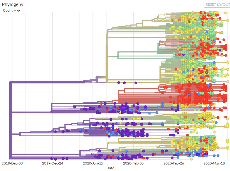
So how do I interpret a dendrogram?
What we are looking at is a tree diagram/layout showing hierarchical clustering i.e. relationships between similar sets of data.
- The different color represents country
- Branch length represents time.
Technically a branch is called as “Clade”. Clades are arranged according to how similar (or dissimilar) they are. Clades that are close to the same height are similar to each other, clades with different heights are dissimilar – the greater the difference in height, the more the dissimilarity.
For an interactive visualization you can visit: https://nextstrain.org/ncov
Key Visualization Challenges:
1. Understanding the numbers in the given context – The key difference between 500 diseased individuals in a country with total population of 50+ million and same 500 infected people in a country with population of 1 billion can make a huge impact.
2. Understanding the numbers with relation to the period: The differences between current numbers and projections must be clearly highlighted to avoid spread of fear and panic.
3. Understanding the domain related boundaries: The difference of analyzing data from a mathematical/analytical standpoint and not from a domain expert’s perspective. Epidemiology is a field unto itself with serious consequences.
4. Understanding the ethical considerations: The difference between presenting visualizations through interpreting data and presenting an induvial opinion that can be biased must be clearly understood in order to avoid stigmatizing.
5. Understanding the demographics: The difference between generic data and demographic specific data must be understood to present the visualizations effectively.
6. Understanding the human nature: The thin line between obligation of presenting the data and facts and the effect it can have on the country or risk-group who are undergoing self- isolation/dread must be understood.
Conclusion:
Data visualization has played a key role in understanding the spread and impact of COVID-19. Have you come across any cooler visualization that you know have visualized and tracked COVID-19?
Stay Safe and follow Social Distancing…