A good user experience (UX) is not possible without an excellent user interface (UI), but a great UI does not guarantee a great UX. Delivering a compelling customer experience is very important today due to the trends and standards that are already set in place by companies like Google, Netflix, Amazon, and younger companies like Squelch, Feedmusic, and Crypton, who are wowing customers each time they sign in.
According to a Forrester research report, good UI improves visit-to-lead conversion by 200%, and great UX improves the same by a massive 400%.
So, what is that magic ingredient that helps UI deliver a spectacular UX?
It is a mix of mind and matter, a little bit of science, design, and systems, and plenty of testing. Building a website alone will not guarantee you satisfied customers. You need to continuously optimize your site for search engines like Google, MSN, and Yahoo. Then you must keep pace with the expectations and demands of your audience by updating your website with fresh content, and ensure the design stays clean and clutter-free.
A great UX should make a connection with your users both in a cognitive and emotional state. Social interactions, behaviors and thought processes (or the human psychological factors) are critical considerations you need to take into account while designing a new UX. How we think, feel, and react have a predetermined science behind it, and if the UI can tap into this, a rewarding UX can be created.
Here are a few psychological laws that can help in designing a great user experience:
-
-
Make User Journeys Easy, Intuitive and Effective
An easily navigable website helps drive user engagement and conversions.
To make your site as user-friendly as possible, you must first ensure that it is lightning fast. This is possible if you optimize your website and make it light, nimble and lean.
Factors that slow down your site include;
- Poor server performance
- Absence of Content Delivery Network (CDN)
- Dense and heavy code
- Too many plugins and redirects, and
- Non-optimized images
When you address and remove the significant challenges, the site performance will drastically improve.
Customer satisfaction is not an end in itself; this must culminate in desirable customer action and business outcome.
Call-to-action (CTA) buttons are prominent actors in designing the optimal customer journey. You must ensure that the buttons are clearly visible, distinct and placed in the right position, to ensure conversions.
Psychologist Paul Fitts first published his theory on ‘human mechanics and aimed movement’ explaining speed-accuracy tradeoff traits of human muscular movements in 1954. But it is well applicable in interface navigability or human-computer interactions that take place on a multitude of screens – laptop, tablet or mobile, too. According to Fitts’s law, the time required to move to a target (time to click on a CTA button) depends on the distance to it and is inversely related to the target size. So a prominent CTA button that is not lost somewhere at the bottom of the webpage or long-scrolling pages, and seems closer to the user within the UI, has higher chances of a click-through.
-
-
-
Don’t Overcrowd the User
Very often, businesses try to cram in too much information into the webpage. Popups with top features, striking images and graphics, text, grids and boxes, and videos are crammed onto a single page. This creates a cognitive overload with the customer trying to decipher and evaluate too many things at the same time.
A clean, intuitive and straightforward website will be simpler for the user to navigate.
Also, note that Hick’s Law is very valid here. The law expounded by American psychologists William Edmund Hick and Ray Hyman states that “the time it takes to make a decision increases with the number and complexity of choices.”
Reduce the number of choices or options you offer to the customer as he or she evaluates whether to go ahead with the CTA or not. Sign up, opt-in, register, download, watch, buy or subscribe buttons are CTAs that should feature in clean, informative and helpful pages. The UI and UX of the landing page are critical and should gently guide the customer to the most effective outcome.
For example, the CTA in the below Lemonade webpage is distinct and right on top of the page.
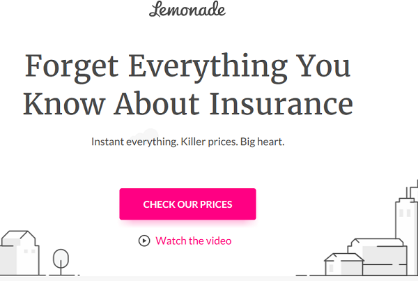
Screenshot: https://www.lemonade.com/- 3/14/2019 As you scroll down the page, you will find short, succinct and helpful information including subscription rates and price comparison with competitors, all in a soothing white background.
Think about applying Hick’s Law across multiple scenarios and elements, such as navigation, menus, and lists. For example, if you give a user a long-form — application or registration form — it takes more time for them to complete everything when we present all the information at once because it takes more time for them to process that data and complete the task at hand.
-
-
-
Pop out to Get Noticed
Von Restorff Effect: Milk, Milk, Milk… NOT MILK!
Marketing and design guru Seth Godin has frequently described how Silk Soy Milk gained market share by being the “not milk” on the milk shelves. Being memorable by being different is precisely what the Von Restorff Effect describes.
Also known as the ‘isolation effect,’ the Von Restorff Effect predicts that “when multiple homogeneous stimuli are presented, the stimulus that differs from the rest is more likely to be remembered.”
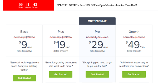
Screenshot: https://optinmonster.com/pricing/ 3/15/2019 It is hard to miss the CTA button on the OptinMonster webpage, it is even tagged as the ‘most popular’!
You can make a CTA button or other prominent content such as product features pop out. Customer testimonials, press mentions, cost benefits, and offers or discounts are different forms of content that qualify to be highlighted, to capture the users’ attention in no time. This is the most powerful effect you can put to use to draw your users’ eyes to wherever you want on the webpage.
-
-
Proximity Spells Similarity
You can make or break a website depending on how critical design elements are placed on a webpage.
The Law of Proximity in website design says, “objects that are near or ‘proximate’ to each other tend to be grouped together.” It is part of the Gestalt Laws of Perceptual Organization.
This law is put into good use in e-commerce websites where similar products are placed in close proximity to show they are part of the same category or cluster. This practice makes it easy, intuitive and natural for users to navigate the site. Similarly, in e-commerce sites, similar products are placed in close proximity in order to make it easy for customers to make buying decisions.
For example, the Indian e-commerce giant Myntra ensures that a snapshot into the entire product range in men and women’s wear, neatly grouped, is available on its webpage.
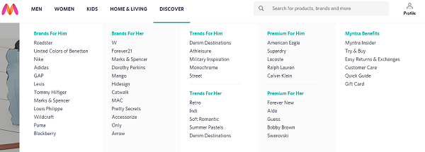
Screenshot: https://www.myntra.com/shop 3/15/2019 In this type of grouping, a shopper who is running short on time will find it easy to locate what he or she wants, in a couple of clicks.
Conclusion
If users find it easy, intuitive and fun to navigate your website, you can safely say that they have a high probability of completing the actions you want them to- whether it is to download a whitepaper, subscribe to a newsletter, like, comment on or share your content, or buy something on the site. So, get inside the mind of your customer, and design user journeys that delight, engage and ultimately sell.
Download our whitepaper and to know more about the psychological approach to crafting a memorable experience for your customers